Recovr is an ozonated oil company offering a fresh take on everyday skincare. Its formulas aren’t about trends, they’re about trust.


Approach


Detail
The structured letterforms exude reliability, while the gentle curves introduce softness, bridging the gap between clinical efficacy and personal care.

( DRAG → )


Approach
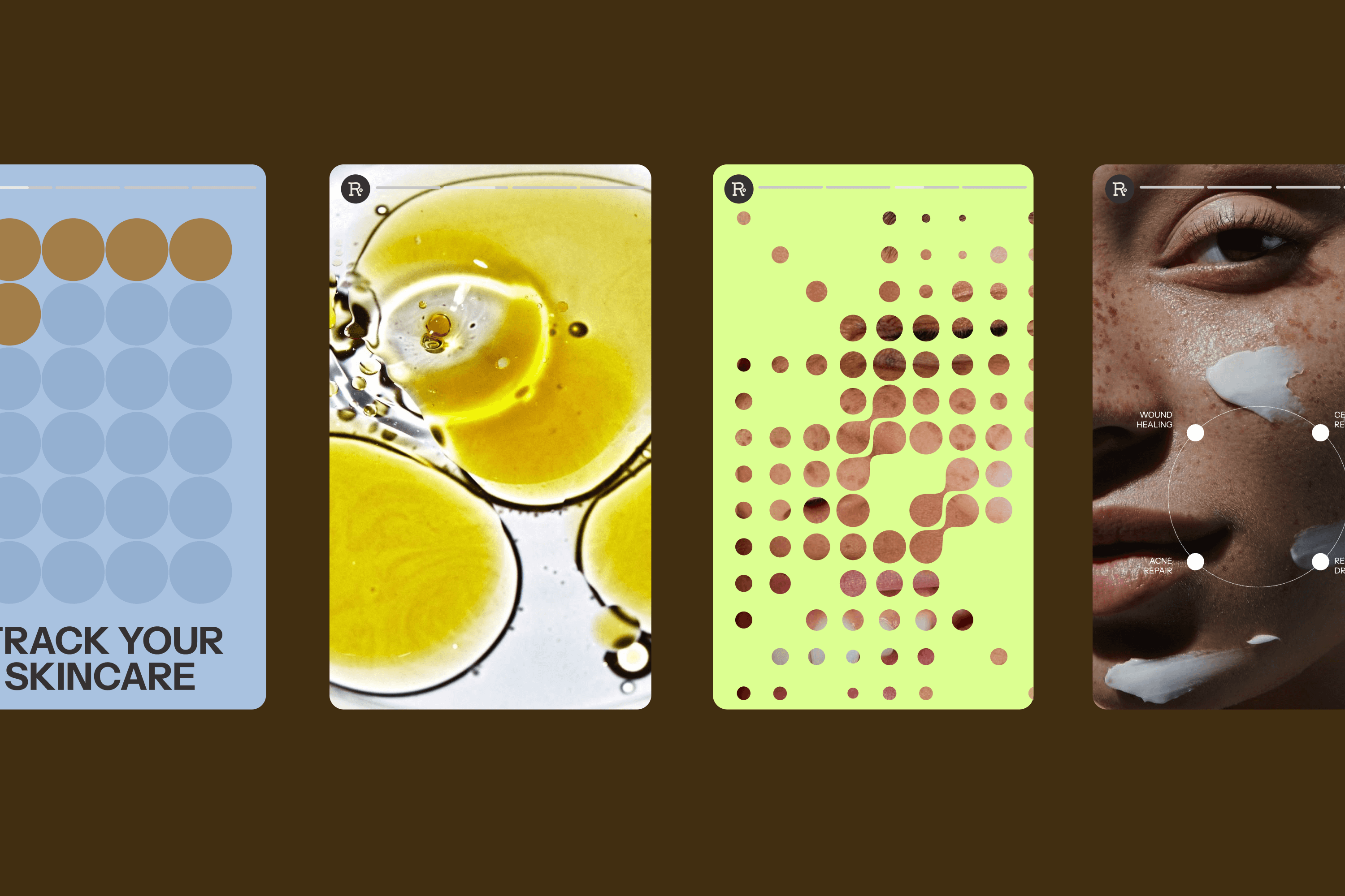
Packaging colours are not just aesthetic; they signal product differences while staying within a calming, science-first language. Icons are inspired by the circular structure of the ozone molecule (O₃), forming a visual shorthand for key product benefits like “high ozone saturation” and “pure and potent.” Imagery follows suit, textured, raw, and refreshingly real.


DETAIL
A recurring visual motif, the circular element from Recovr’s brandmark, appears across social content as a translucent overlay or layered texture. It reinforces the ozone molecule’s shape and adds rhythm to the layout, subtly linking science to aesthetics. These circles act as framing devices, background gradients, or motion elements that give the brand cohesion without overwhelming the viewer.
IMPACT
Recovr is a small revolution in how we approach healing: patient, precise, and personal. By using ozonated oils for everything from eczema and acne to burns and everyday balance, Recovr proves that simplicity, done right, can be powerful. This is care, reimagined.


Recovr

