Chef Pooja Dhingra brought Paris to Mumbai with Le15. Fifteen years later, she loosened the rules. Pardon Our French is what came next.


Approach
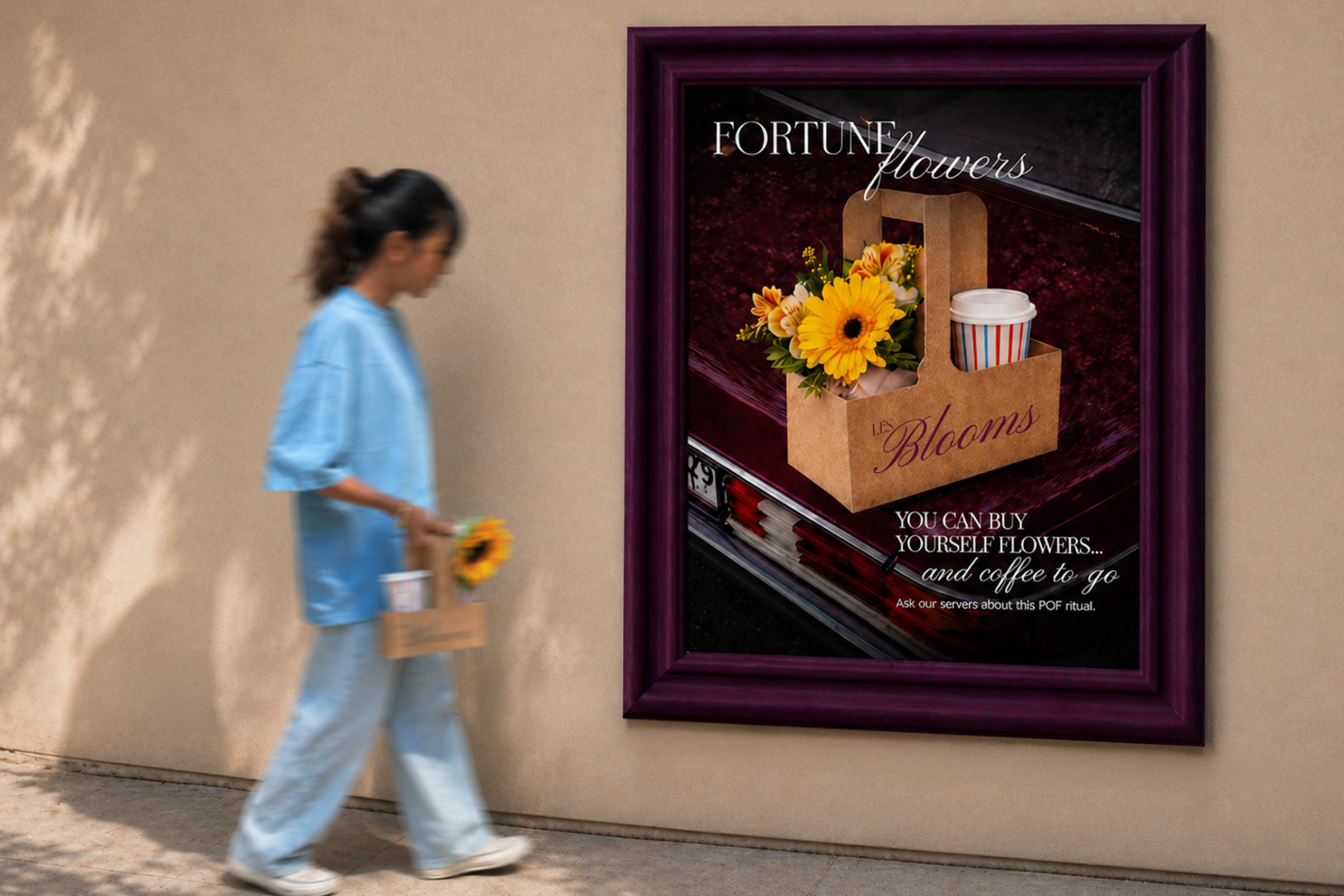
The identity builds on a version of Paris that feels personal, not imported. Light, airy, and easy; more neighbourhood café than postcard. The typography pulls from classic French café signage and high-fashion editorials. Confident without feeling overworked. The colour palette shifts slightly - deeper maroons and blues instead of obvious pastels; giving it a more grown-up, current feel. It reflects where the brand is now, not where it started. The illustration style keeps things from getting too serious. Loose, hand-drawn, and slightly imperfect, it captures small, everyday moments like coffee, pastry, flowers. Stripes run through the entire system. Not just as a graphic, but across the space - cups, packaging, curtains, even ceramics. They create consistency without making everything feel identical.

( DRAG → )


Detail
The menu was designed to change. Inserts swap in and out as dishes come and go, which, at Pardon Our French, is often. The mixed media style makes this feel intentional rather than interim. Every version feels complete, even when something new is on its way in.
IMPACT
From the cake box to the Instagram grid, Pardon Our French holds together as a world worth lingering in - coffee, cake, or flowers, it all belongs. Confident enough to have a point of view. The chef didn’t reboot Le15, she gave it room to dance without the recipe.